how disney world can capitalize on live activity notifications this fall
published june, 2022
published in UX Collective
This year at Apple’s WWDC, they announced a new feature called Live Activity. This feature allows app developers to create a more persistent notification experience. From tracking the score of your favorite sports team to knowing exactly when your Uber will arrive without unlocking your phone. This is a powerful feature for the usability and user experience of certain apps. It allows you to not have to unlock your phone, search for the app, wait for it to load, and finally get the information you want. With Live Activities, you simply just glance at your lock screen and know the status of what you’re waiting on or the event you’re following.
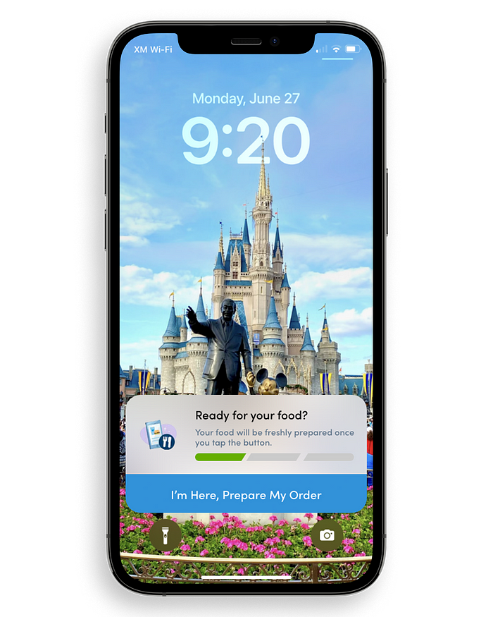
This is where Disney World, along with their app, My Disney Experience, comes into play. I decided to make a concept as to what these Live Activity Notifications could look like while keeping the same style as the app. The first integration was with the mobile ordering experience. Mobile ordering took Disney World by storm within the last year and a half due to the COVID pandemic and this has brought about some friction among users. Most users think the process of ordering food and picking it up is too cumbersome and confusing, so they opt for waiting in line, now that COVID restrictions have been lifted. Meaning, that all the time and money invested into the mobile ordering experience has gone unnoticed. This feature added to the app may pour some grease to reduce the friction and make it more usable.
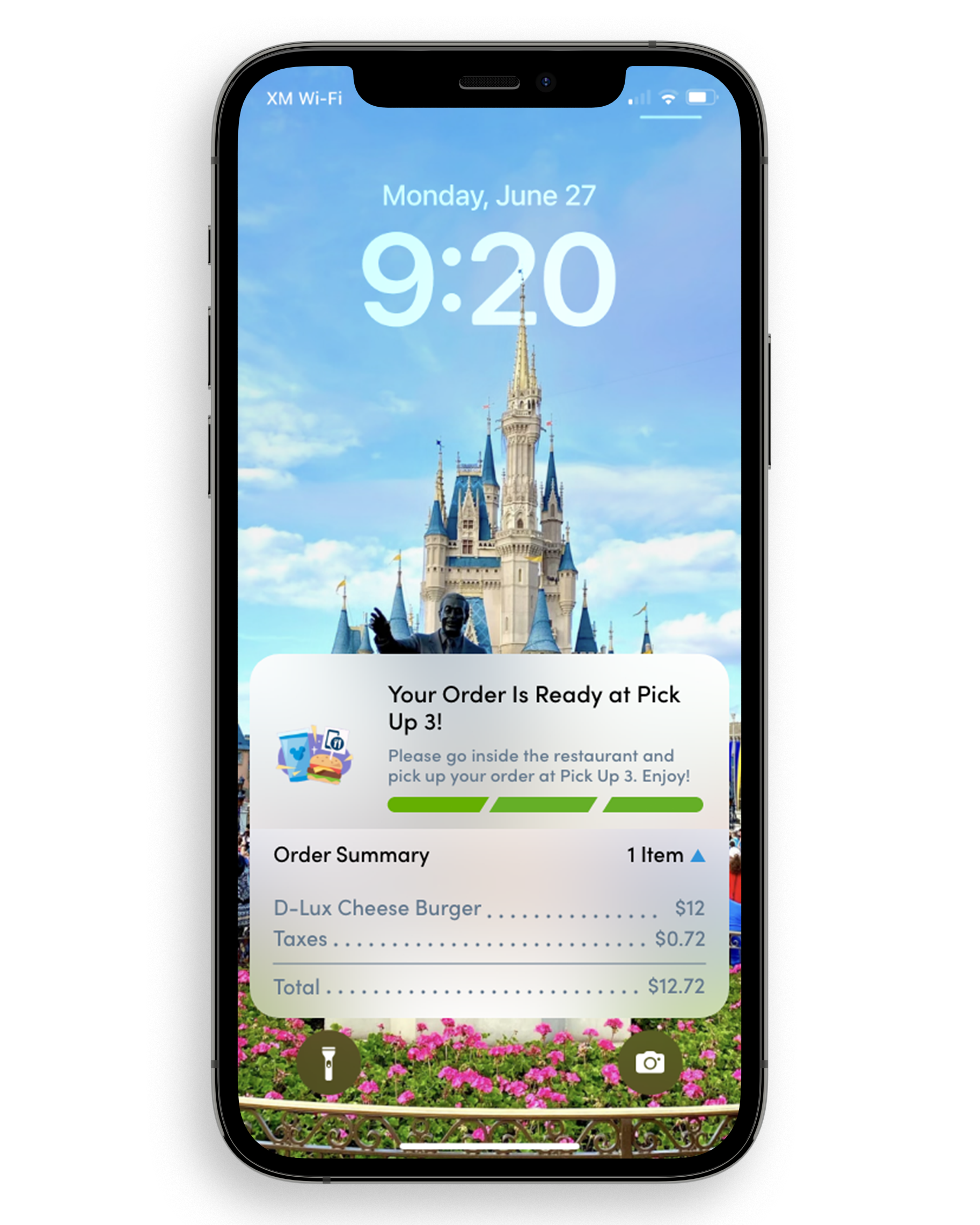
The current UI for checking the status of your order is very similar to my solution in Live Activities. But the advantages, come with not having to open your phone and find the button to press. It’s right in front of you. This prompt appears right after you place your order. I thought of the idea of only showing it after you were within a certain radius of the restaurant. But, the decision was made to disregard this choice because of finicky GPS signals and the failure case where someone could be inside the restaurant but their GPS is off and therefore wouldn’t be able to start the order.
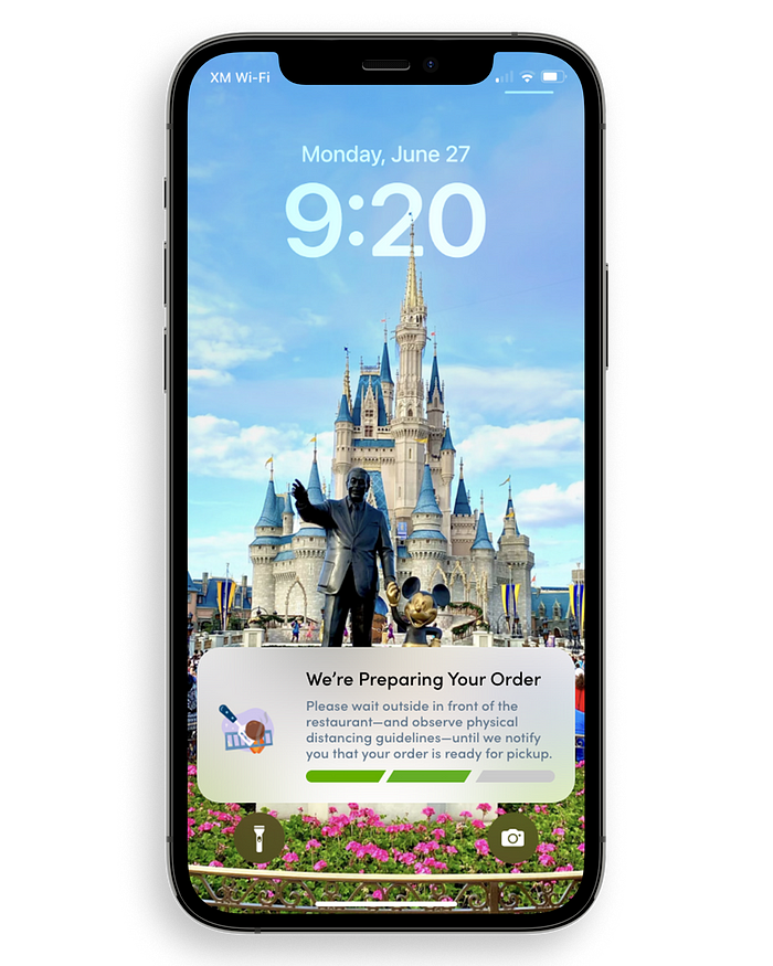
The second step is really just a status. For the user to know that the order is being made. And for the user to know that the notification isn’t stuck, or crashing, the illustration on left will animate, and flip the burger every now and then. Also, the greyed-out progress bar will have a pulsing lighter grey going from left to right. Just some visual queues to make sure the user knows, “Ok, my food is cooking and this notification is continually updating and is alive so I just need to wait until the whole progress bar is green.”
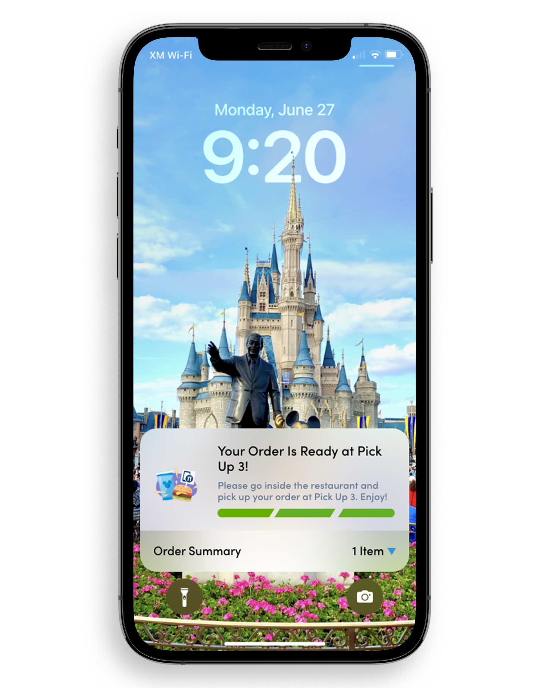
The third and final step is the confirmation screen. This tells the user that their food is ready and where to pick it up quickly and easily. This screen expires after 20 minutes, or if you dismiss it. You can also look at granular details in the order summary. If you tap on the bottom section anywhere, you get a breakdown of the costs per item.
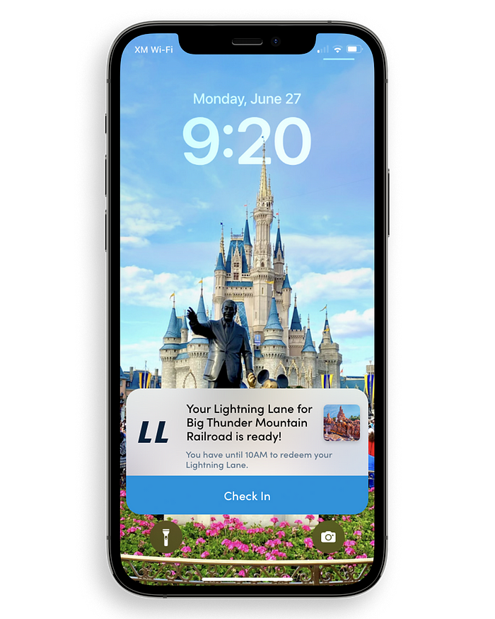
The other implementation I saw that this brand new feature of iOS could be used is with Lightning Lanes. Some of the same issues have been present since the introduction of Lightning Lanes versus what was previously available, FastPass+. Users have complained about waking up early just to reserve two passes for the day of. Now, there are multiple issues with the user’s flow when looking at Lightning Lanes, but I’m only going to focus on the user’s flow after a reservation is made. What can be enhanced within the park? How can it be even easier to use the technology available and sprinkle a bit of pixie dust on every user’s day?
The implementation is very similar to mobile ordering. But there are a few differences when you “Check In.” So, once again, the ability to check in is not tied to GPS. Because you can’t use the Lightning Lane on anything but the ride it’s assigned to, you can check in wherever so long as it’s within the time frame of your reservation.
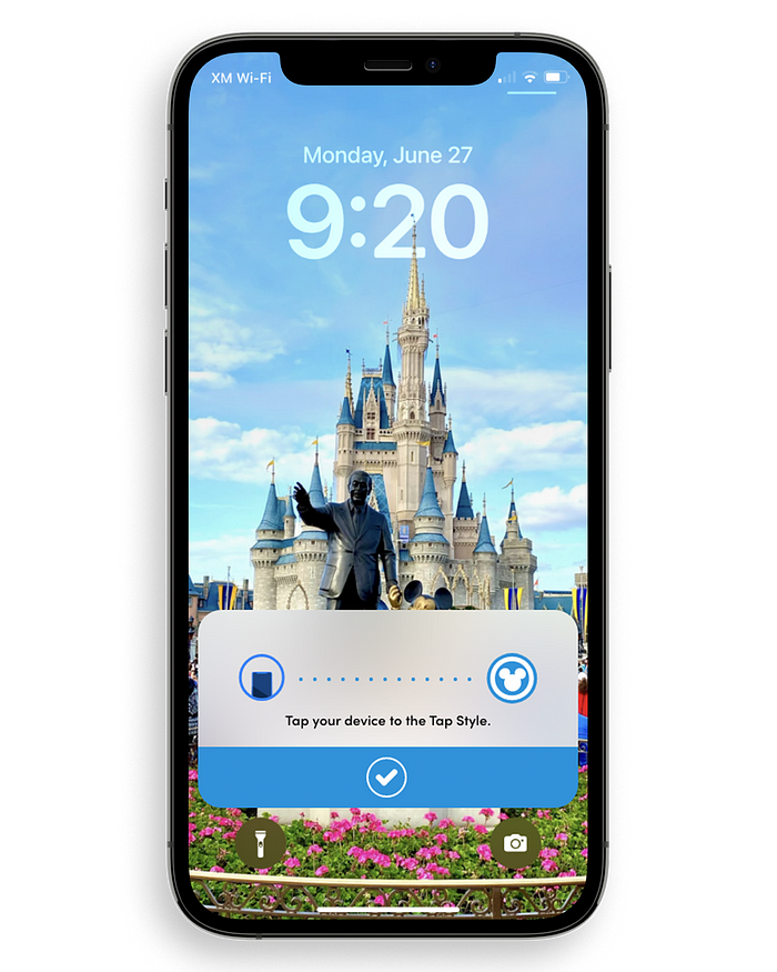
After you check in, your phone acts as an NFC ticket for the Lightning Lane just like when entering the park at the tap styles. This would be a small animation on the left similar to when using Apple Pay. And the dots in the middle would pulse from left to right.
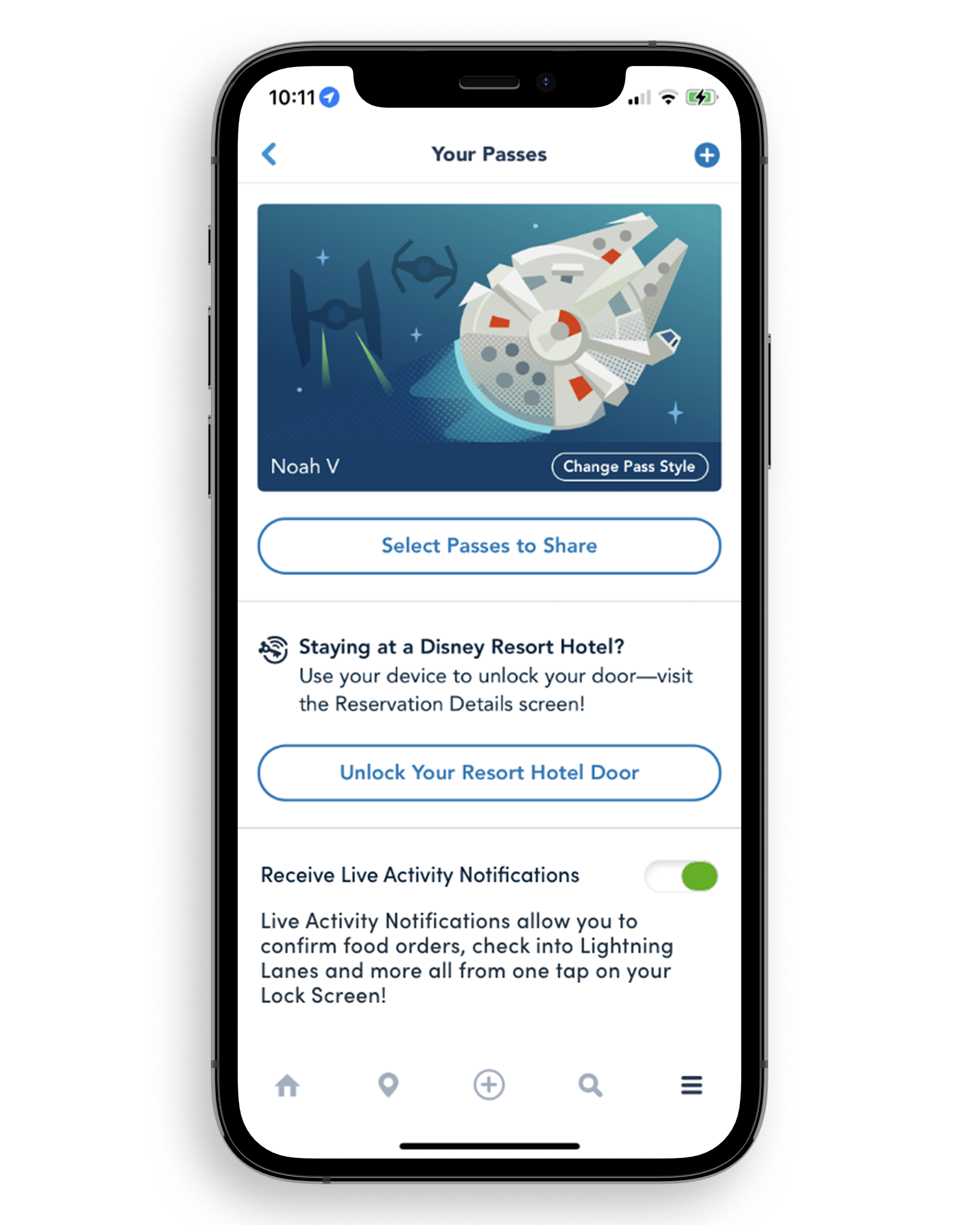
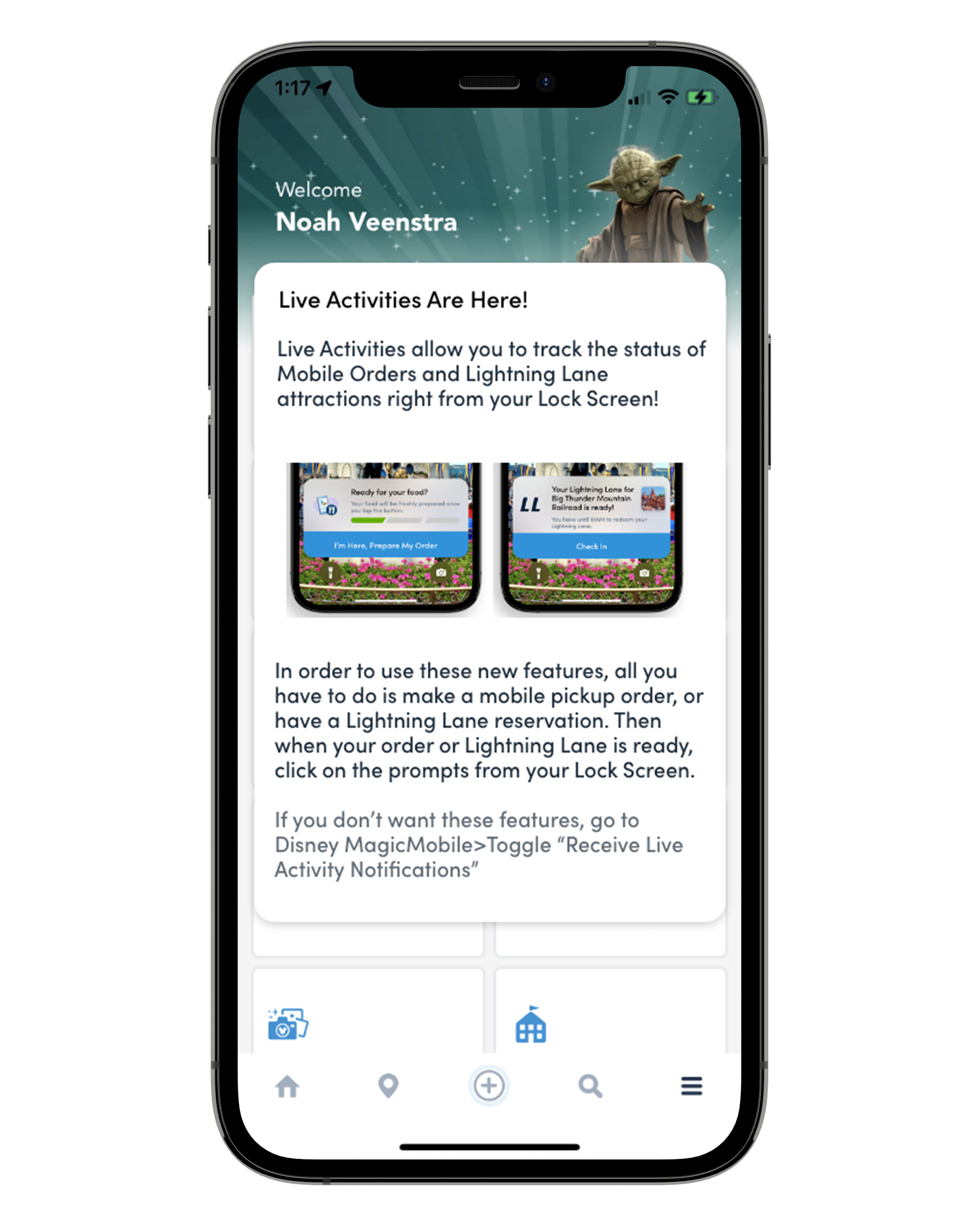
As I began exploring these new features and this brand new user flow, I knew that I needed to build in an introduction on how to use this new feature that will take up a lot of screen real estate for potentially a long time. And I needed to build a way to disable it completely. So, I brought it to the user plain and simple. When they tap on the burger, where all the settings are, for the first time since the update, they see this splash screen. It gives a preview of what these notifications will look like, what they do, and exactly how to turn them off. The ability to be completely transparent with new app features I believe is critical to building trust and allowing for the acceptance of new features that could come later.
Look at the live prototype.