Case study · 2024
Instagram Posting UI

I explored how Instagram’s posting screen might better balance a growing number of options with the task of creating a post. This independent 2024 concept began with my own assessment of the interface; it was not commissioned by Instagram.
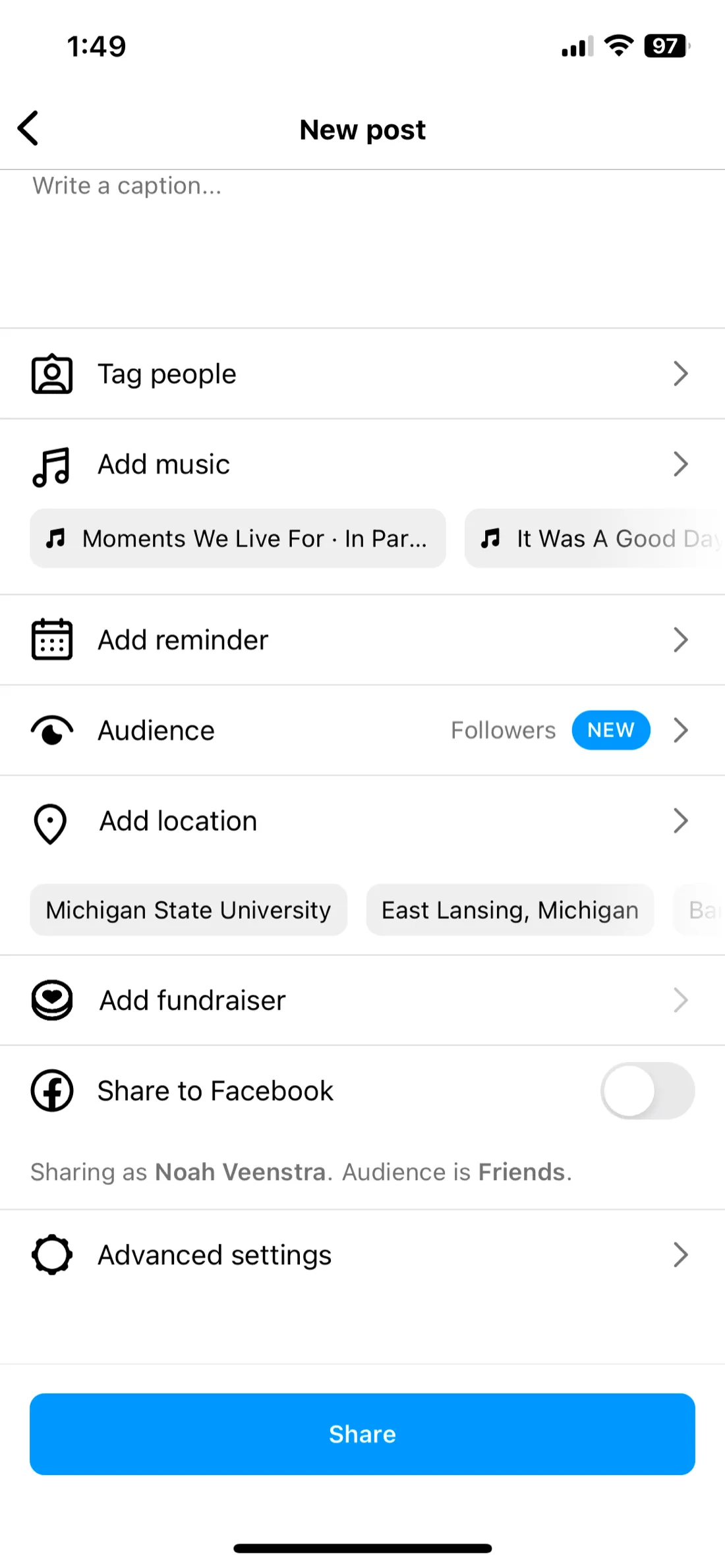
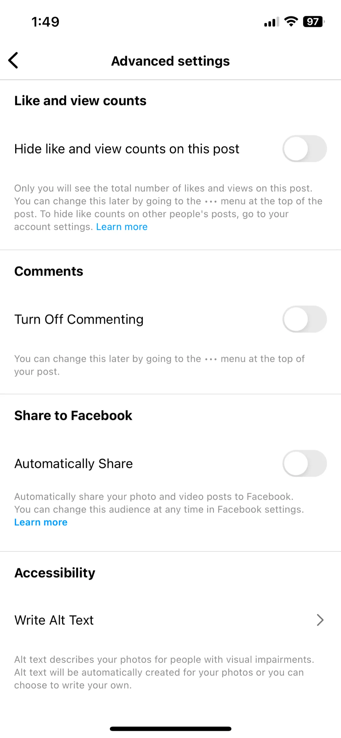
In the version I reviewed in 2024, the compose screen placed options such as scheduling, fundraisers, audience controls, and Facebook sharing beside the post itself, with additional settings on another screen. I read that as a hierarchy problem: people were composing, but less common choices competed for attention before they were needed. That was my observation, not a research finding. I had not tested the concept with Instagram users, so my assumptions about which controls were common and whether the layout slowed people down remained unvalidated.
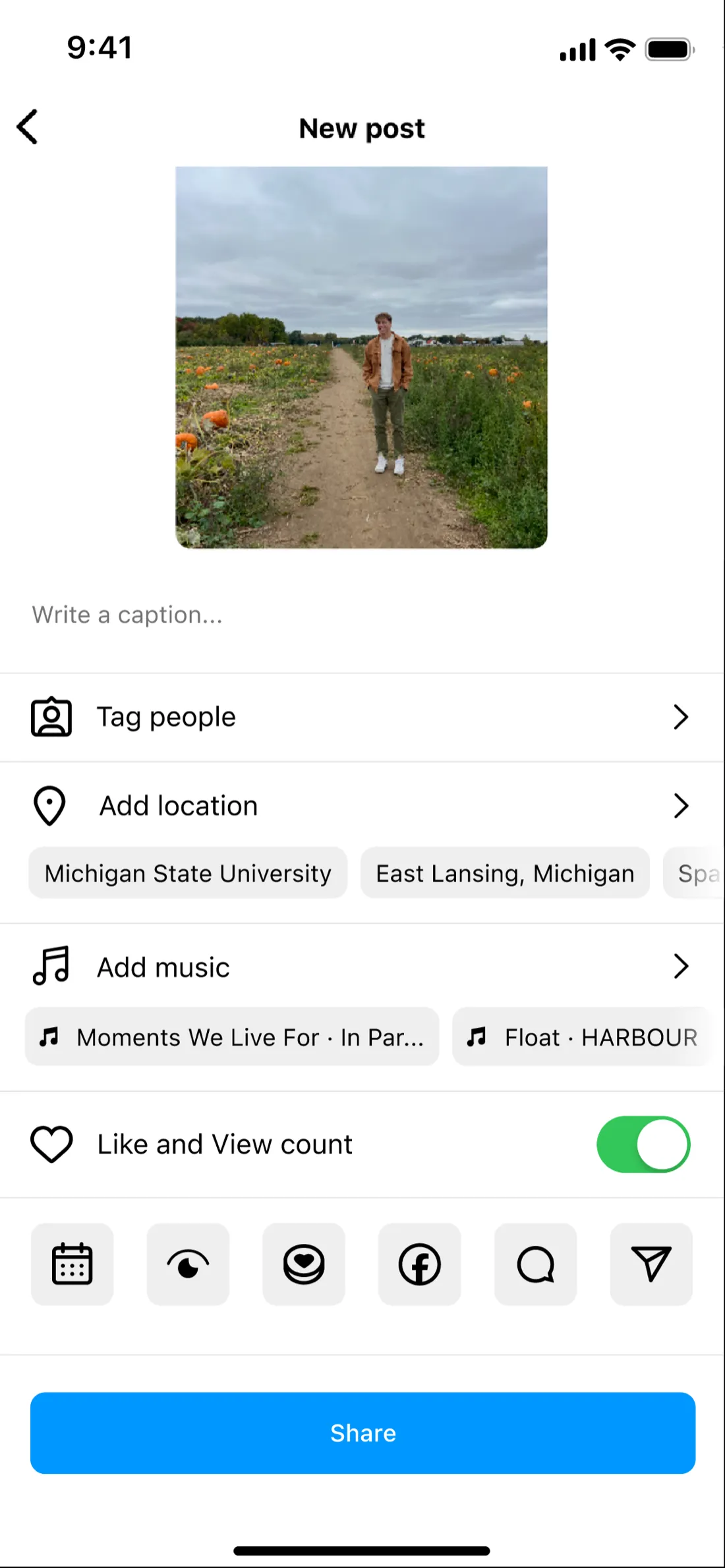
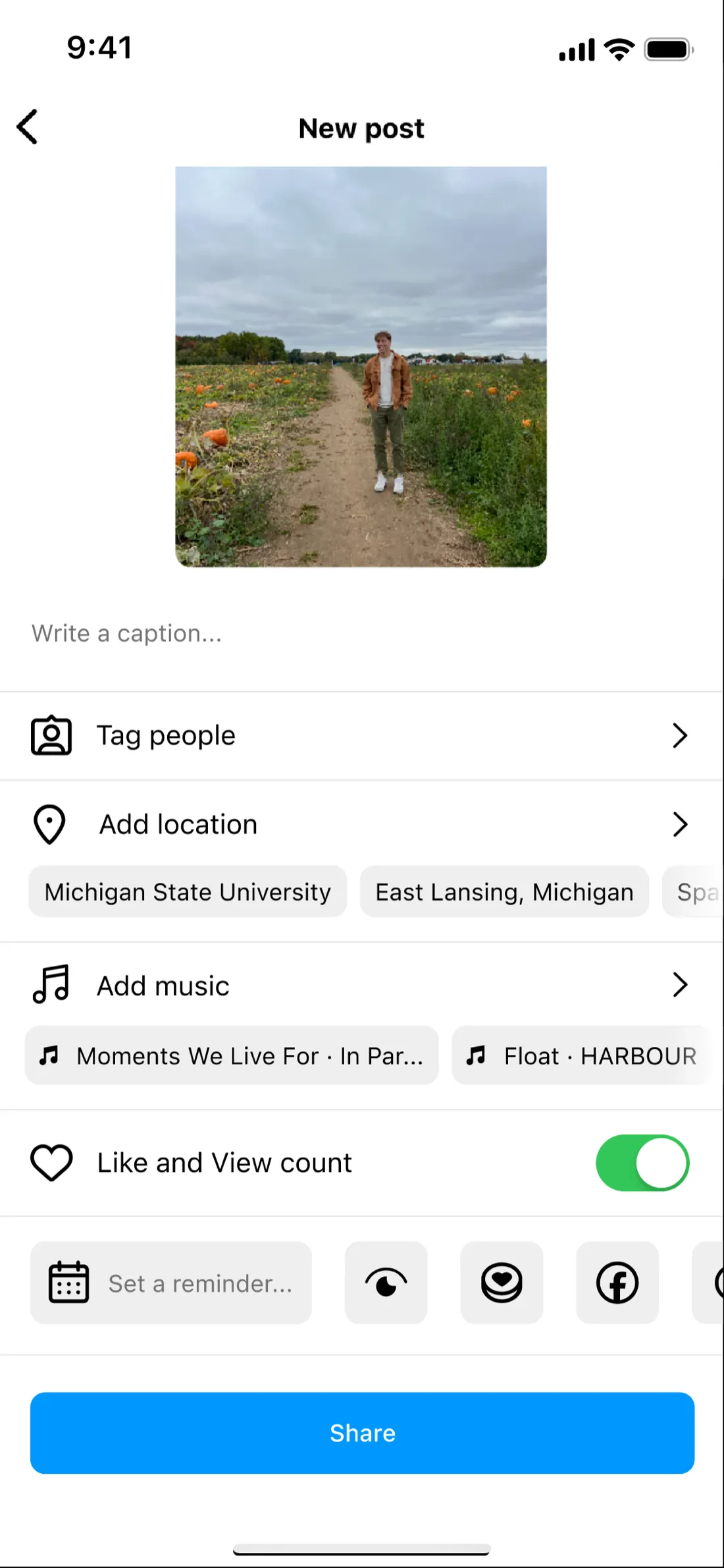
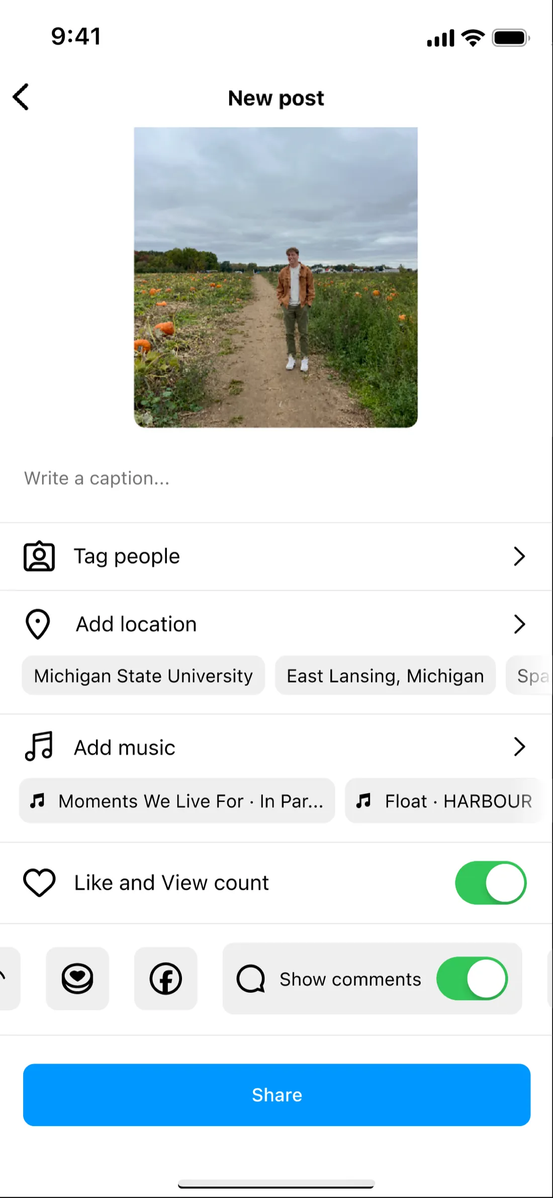
I explored a simpler primary surface for the post and its essential choices, with advanced controls grouped in a toolbar that expands on tap. The tradeoff is that moving a setting behind one more tap could make it harder to discover. I did not test the concept, so whether it actually made posting easier remains an open question.